
Is the Fed Responsible for Market Turmoil?
In a Wall Street Journal article published June 11, 2009 Arthur Laffer described "ill-conceived government reactions" to the financial turmoil as leading to inflation. His closing line was unabashedly personal: "For me the issue is how to protect assets for my grandchildren.". This monograph is intended to examine that notion with a eye toward how Federal Reserve actions exacerbate the situation in the long run. Another principle goal is to address the purpose of government, which is to reduce uncertainty. Extreme value theory, often modeled using stable laws, is a statistical technique for measuring uncertainty. A close look at recent events indicates that government is injecting uncertainty into the market.
Data for this work is from the St. Louis Federal Reserve Bank adjusted monetary base, from the link below. Using the default settings (Billions of Dollars and Excel format) the file name will AMBSL.xls
http://research.stlouisfed.org/fred2/series/AMBSL/downloaddata?cid=124
The chart in Mr. Laffer's article shows the change in monetary base since 1961, below we first illustrate the monetary base itself for over 100 years.
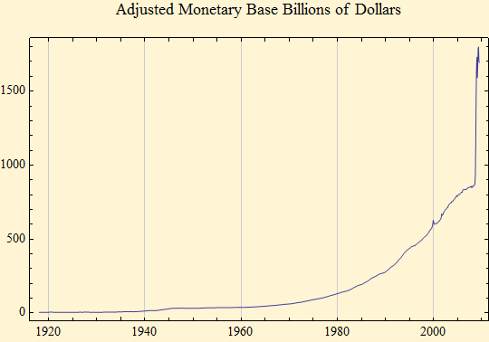
It is useful to work with the natural log of a series to make it more mathematically tractable. Below the data are converted accordingly, the effect of which is to "linearize" the data. (Those tuned to mathematical particulars will recognize that even such a powerful concept as the natural log cannot linearize a curve as steep as this one becomes at the end.)
![Graphics:Adjusted Monetary Base Log[Billions of Dollars]](HTMLFiles/MonetaryBase_2.gif)
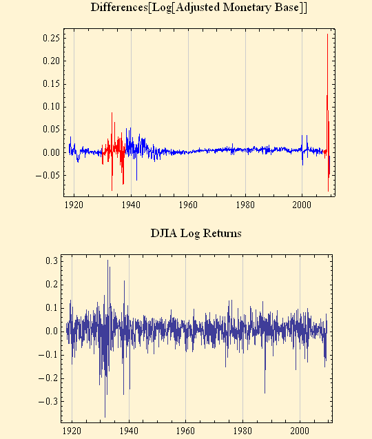
There is much controversy in economics over whether government can fine tune or dampen an economic cycle by rotating between "tromping on the gas" and "slamming on the brakes" in the economy. This is what Mr. Laffer refers to when he laments "a radical move...signal[ling] a 180 degree shift..." Our interest is in looking at how these rapid shifts introduce uncertainty into a market which may be trying to right itself. The Laffer data showed the annual change. We will look at the monthly change behavior, something not visible in the accumulated series. The graphs below show the Fed manipulating the money supply in a high-risk pattern that emerges as stable behavior. [Note: The choice of words here is unfortunate. Statistical distributions which are termed "stable" mean that they contain extreme values outside the normal. The word "stable" in this context refers to mathematical principles of stability having to do with the additions of sums of these variables. The common use of the word "stable" has nearly the opposite connotation. Thus, the reader must view "stable behavior" in its strictly mathematical sense and accept that such behavior in economic statistics leads to unstable market activity in common parlance. An observation of statistical stable behavior means that uncertainty is rising or at least greater than it has been.]
Below is a plot of Monetary Base Differences. This is the monthly change in monetary base. Notice three eras characterized by extreme values (therefore stable behavior, hence uncertainty). One was the Great Depression - WWII, the next during the Technology Bubble early in this century. These two are dwarfed by the volatility at the end of the plot representing today's circumstances.The second plot is market movement as measured by log returns of the Dow. With the exception of the 1987 crash, essentially a one day event, one has to go back to the 1930s to find a concentration of volatility of the sort recently recorded.
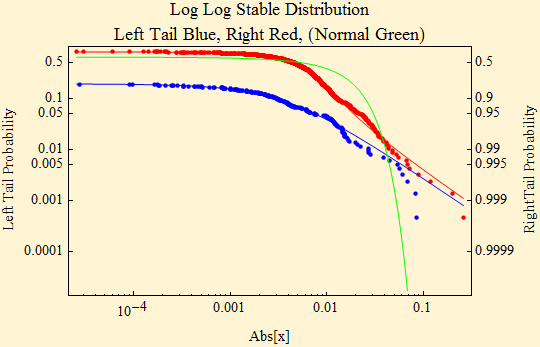
Mr. Laffer took liberties with his description of the situation. While we wish to elevate the conversation to include some technicalities, to avoid a morass of mathematically demanding details, we will also skip over some aspects. Elsewhere in mathestate one can find tutorials on stable distributions and a description of the four parameters that describe stable data. Below we show the parameter values of the data we are using. Our interest is in the first of these, α, the index of stability and primary determinant of tail thickness. The thicker the tail the more extreme values, thus the more uncertainty and volatility in the series. α falling away from 2 toward 1 is an increase in tail thickness. α is an exponent so small changes in its value have a large affect on tail behavior. When α is 2 things are normal in the statistical sense and, with lighter, shorter tails, also "normal" in the common meaning of having less uncertainty. α below 1.5 increases the probability of extreme events.
| α | β | γ | δ | |
| Fed | 1.2992 | 0.138375 | 0.00345515 | 0.00515402 |
| Dow | 1.67297 | -0.480323 | 0.0286594 | 0.00279081 |
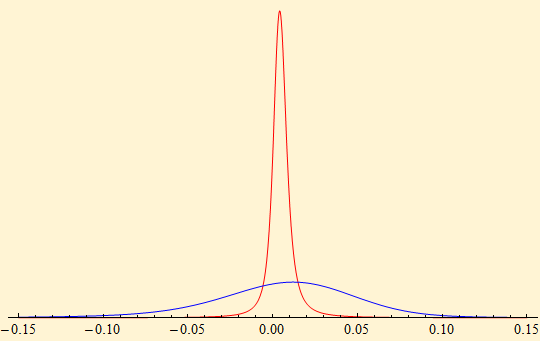
Another graphic approach, and one that may be more familiar, is one which displays the distribution in density form. Below are the two data series we are using. They have very different scale factors so the relationship between the two in the tail area is not easily seen
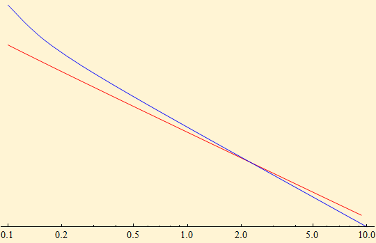
An enlargement using log plots show the tails crossing and the Fed (red) data having the heaviest tail extending beyond the tail of the Dow data. It is here we ask the question: Is this what government should be doing? Fed monetary policy is MORE variable in the extreme areas than the movement of the investment future of the citizenry. We prosecute people for shaking babies, yet we tolerate this behavior in economics when the effect, if not just a tragic is just as ill-advised.
Here we see the tail behavior of both the empirical data (dots) and the theoretical tails (blue and red) based on the parameters. These coincide nicely and display stark difference from the normal alternative. If government were reducing uncertainty, as it should, all the plots would dip down at the same rate as the green plot, approximately coinciding with the normal.

© Copyright 2009 mathestate Mon 17 Aug 2009